WEBSITE & SEO CASE STUDIES
You Don’t Need a Flashy Website to Succeed
Instead, what matters most is having a site that clearly communicates what you do, is easy to navigate, and is designed to help the right people find you through search.
The following examples show how that can look in real life — and how different it can be for everyone.
Each client came to me with a goal or challenge, and together we achieved clarity through thoughtful design and intentional optimization that suited their unique needs and audience.
When your website is focused and well-organized, it can quietly boost your visibility and growth — without the need for constant self-promotion or being everywhere at once.
As you browse these examples, imagine the positive changes that could happen if your own website and supporting elements felt as clear, steady, and supportive as you want them to be.
CASE STUDIES
Scroll through them all, or use the Table of Contents to navigate:
(These examples show work at launch time; many clients update their own websites so current live versions may have changed.)
Top of Organic Search Results for 15 Years - Day Spa
From Crickets to Sold Out With Strategic SEO - Entrepreneur
Laying the Groundwork for a New Web Presence - Multiple Businesses
Optimizing a New Web Page for a Book Launch - Author / Illustrator
Developing a Web Presence for Multiple Disciplines - Author / Reiki
Building a Brand & Web Presence - Artisan
Building a Simple, Effective Website & Class Registration - Art Instructor
Developing a New Web Presence
- Lake Tahoe Photographer
Tech Help & SEO Assessment - Children's Author
Keeping Website Current - Sustainable Design & Construction
Making the Website Easier to Use - Events & Lodging
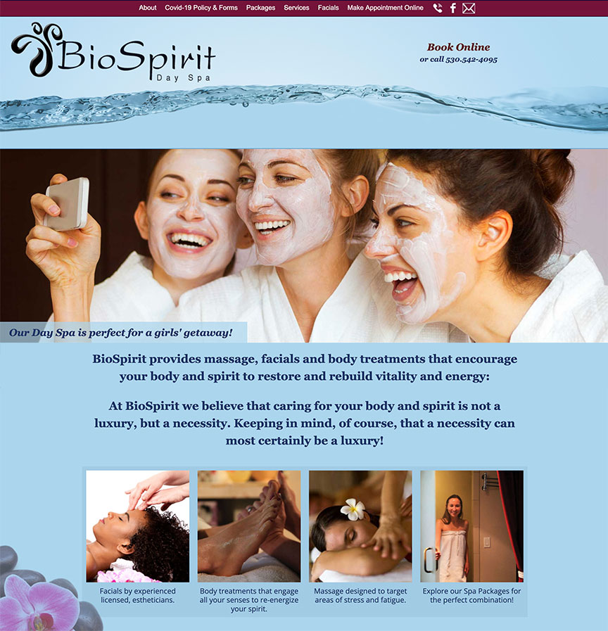
BioSpirit Day Spa
Top of Organic Search Results for 15 Years
CHALLENGE: Reach more ideal clientele, keep the calendar full year-round, and stay competitive in a tourist-driven market.
STRATEGY: Align marketing with values and community outreach for the best engagement and stay ahead through consistent SEO.
KEY TAKEAWAY: A clear, user-friendly site that shows up in search is a real business asset—something you can grow with and eventually sell. It doesn’t require hype, but it does require ongoing care.
BioSpirit Day Spa was my client for 15 years. During that time, I redesigned her site several times so it stayed current, reflected how her spa was evolving, and genuinely helped visitors decide to book.
Each month, I made simple SEO updates: tracking how people were searching, reviewing her analytics, and making practical changes based on real behavior. When we started, her site got only a couple of hundred visits a month and had a high bounce rate (the percentage of people who land on your site and leave almost immediately—ideally you want ~40% or lower). After we clarified her content and improved the user experience (UX), her traffic grew to hundreds of ideal visitors each month, and the spa got noticeably busier. This was not extra traffic. It was the flow of ideal people that fit the needs of the business.
This monthly focused work helped her show up for multiple search phrases near the top of the organic (unpaid) search results. By keeping her local SEO strong and making sure each page had clear, up-to-date content and keywords, she consistently appeared within the first few listings for many important searches. But this monthly upkeep didn't take hours. It took about 15 minutes because a strong foundation was already in place.
Meanwhile, she focused on outreach that felt natural to her—local ads, simple social posts, and a focused newsletter with timely specials. That steady, thoughtful approach helped her grow the business through economic ups and downs, and in 2022 she sold it to pursue other passions — with a strong, proven website as part of what made the business valuable.

(Graphics from her website are shown above.)
DreamWeight Blankets
From Crickets to Sold Out With Strategic SEO
CHALLENGE: Competing with larger brands and reaching the right audience with limited marketing resources.
STRATEGY: Highlight unique features and boost visibility where it matters.
KEY TAKEAWAY: When your marketing plays to your strengths and focuses on the right people, even a one-person business can stand out in a crowded market.
DreamWeight Blankets was up against big, well-funded companies selling cheaper weighted blankets. But this client had something the others didn’t: a highly specialized product with benefits most people had never seen before. What she needed was a clear way to explain why her blanket was different—and why it was worth the investment.
I started by reviewing her Shopify site and spotting places where her message was getting lost. We refined her website copy so visitors could quickly understand what made her blankets special. I also implemented a simple but thorough SEO strategy and designed supportive graphics for her website and social media, using the photos she provided. Together, these updates made her product’s value easy to see at a glance.
Because her favorite platform was Pinterest, we focused our marketing there instead of trying to be everywhere at once. I used targeted keywords, clear descriptions, and scroll-stopping visuals that matched her ideal customers. Then I created a step-by-step guide so she could confidently create her own posts, use keywords without overthinking it, and stay consistent.
Soon after these changes went live, her sales took off. Orders came in so quickly she temporarily sold out. This wasn’t luck—it was the result of clear messaging, thoughtful SEO, and choosing a marketing approach that fit both her personality and her product.
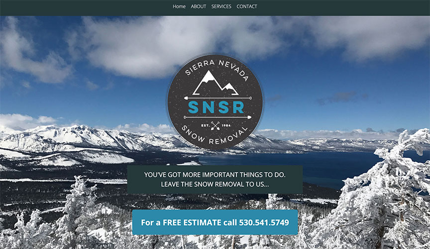
Sierra Nevada Snow Removal
Laying the Groundwork for a New Web Presence
CHALLENGE: Create an online home for a long-running business with no website or digital presence.
STRATEGY: Start from scratch with a clear, easy-to-use WordPress site and basic SEO.
KEY TAKEAWAY: When your different businesses are connected online, each one helps the others get found and taken seriously.
Sierra Nevada Snow Removal had been serving local customers since the 1980s, entirely without a website. As more people started searching online and new competitors appeared, the owner realized that word-of-mouth alone wasn’t enough anymore. In 2017, he asked me to create a simple, effective website that would finally give his business a solid online home and help new customers find him through search.
Because there was no existing web content, we started from a blank page. I took his rough notes and bullet points and turned them into clear, friendly website copy that explained what he does, who he serves, and how to get in touch. I also looked at local competitors and his ideal customers to shape the content and SEO so he’d show up when people nearby searched for snow removal.
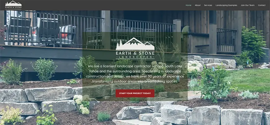
In 2024, the same client bought Aspen Hollow Nursery, another local business I’d worked with before. To keep things moving, I first built a simple landing page while planning a fuller website. I also began mapping out a new site and SEO for his landscaping company, Earth & Stone Landscapes (see image below).
By linking all three sites, we created a small network that works together: each business supports the others in search results, builds his credibility in related fields, and makes it easier for customers to find exactly what they need. This connected approach sets his businesses up for steady, long-term growth without relying only on constant advertising.

With love, from tahoe
Optimizing a New Web Page for a Book Launch
CHALLENGE: Create a clear, effective web presence for a niche environmental book while balancing several different professional roles on one site.
STRATEGY: Build a focused book launch page, then support it with simple, trustworthy SEO and high-quality backlinks from relevant sources.
KEY TAKEAWAY: A clear, specific page paired with basic authority-building strategies can successfully launch niche projects while keeping your website understandable and credible—even if you wear many hats.
This is the launch page for my environmental stewardship book, With Love, From Tahoe. Before touching the design or copy, I clarified two things: who this book is really for and what problem it solves for them. Without that clarity, any marketing or SEO is just guessing.
I had already written a detailed grant proposal for the book, which helped me sharpen my understanding of my ideal readers and what they care about. I also started talking about the book early on. Those conversations showed me what resonated, what confused people, and which questions kept coming up.
With my target audience defined, I then focused on authority-building. A great way to gain search engine credibility is by leveraging high-quality backlinks from diverse, trusted sources. To establish my site’s authority in this niche, I secured backlinks from news outlets, relevant social media communities, and subject matter experts who aligned with my project’s theme. These backlinks did more than boost SEO—they drove targeted traffic, built buzz, and positioned my work as credible and valuable within its niche.
Once I knew my audience, I focused on building trust and visibility by getting backlinks from the right places—news outlets, aligned social communities, and subject-matter experts who believed in the project. Those links didn’t just help with search; they brought in curious, relevant visitors and created real buzz.
The result: the launch page performed better than expected, drawing in the right people, growing my subscriber list, and leading to a meaningful number of book downloads.
SIDE NOTE: If you’re a creative or solo business owner with multiple roles on one website, it’s important to clearly explain how they connect. Otherwise, both visitors and search engines may struggle to understand what you actually do, which can drag down your results. I plan my content and navigation with this in mind across my entire site.
Suffering to thriving
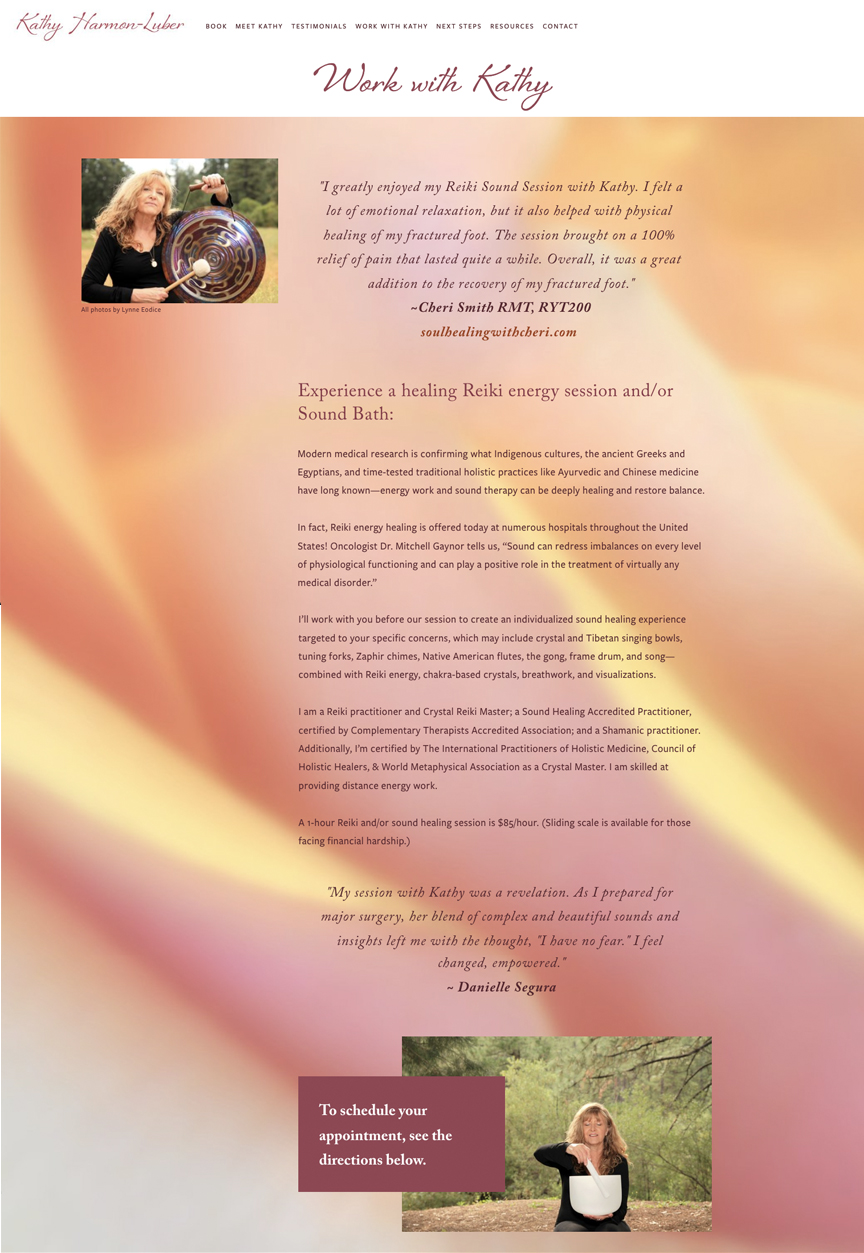
Developing a Web Presence for Multiple Disciplines
CHALLENGE: Create a flexible website to promote a book, highlight healing services, and support a growing media presence.
STRATEGY: Build a clear, easy-to-navigate Squarespace site that showcases multiple offerings, supports SEO, and makes it simple for visitors to connect.
KEY TAKEAWAY: If you’re multi-passionate, a well-organized website that speaks to each part of your work can make it easier for people to find you, understand what you do, and take the next step.
Kathy Harmon-Luber needed one online home for everything she does: launching her book Suffering to Thriving, promoting her healing work, and showing up as an author and speaker. She already had a strong vision for the site, including service pages, a press kit, and a simple way to share a guided visualization with the right people.
To support that, I set up an automated email system that delivers her guided visualization as a thank-you when someone joins her list. This feels like a genuine gift, not a sales push, and it gently builds trust over time while supporting her larger business goals.
Because Kathy often writes articles and appears in interviews and podcasts, I built a dedicated area on her Squarespace site to feature those media appearances. Regularly updating that section with new articles, podcasts, and features not only keeps the site feeling alive, it also helps with search visibility and positions her as a go-to expert.
The finished website brings together all sides of Kathy’s work—her book, her services, and her media presence—into one clear, welcoming experience. As her business grows, her site can grow with it, helping her reach more of the people who need what she offers.

Artful Leather
Building a Brand & Web Presence
CHALLENGE: Build a brand-new identity, website, and SEO strategy for a new business.
STRATEGY: Create a lean, static website with clear branding and focused SEO to gain early traction.
KEY TAKEAWAY: A simple, fast website with thoughtful SEO and user experience can become a solid, low-maintenance foundation for growth.
Artful Leather launched as a bespoke purse brand, using responsibly sourced materials and ethical production methods. From the ground up, I created her visual identity, crafted a cohesive website, that reflected her style and values. I also put strong, strategic SEO in place so she could start showing up in the right search results and attract customers who cared about quality and craftsmanship.
SEO is powerful, but it works over time, not overnight. While her search visibility was building, she leaned on her personal network and social media—especially Instagram and Facebook—to get in front of her first ideal customers and start building momentum.
Instead of using a content management system like WordPress, we chose a static HTML site: simple, fast, and secure. This setup is ideal for business owners who want a “set it and forget it” website without plugins, constant updates, or technical maintenance. With minimal code and no extra scripts, her site loaded quickly and stayed stable—something search engines reward. This gave her a performance edge over many template-based platforms like WIX and Squarespace that often add hidden code that slows sites down.
Artful Leather also needed a stress-free way to take orders without slowing the site or overwhelming her with tech. A full e-commerce setup felt like too much for this stage, so we created a streamlined order form and connected it with Square invoicing. She can now handle custom orders smoothly, keep her site fast, and still has room to grow into a more complex system later if she wants.
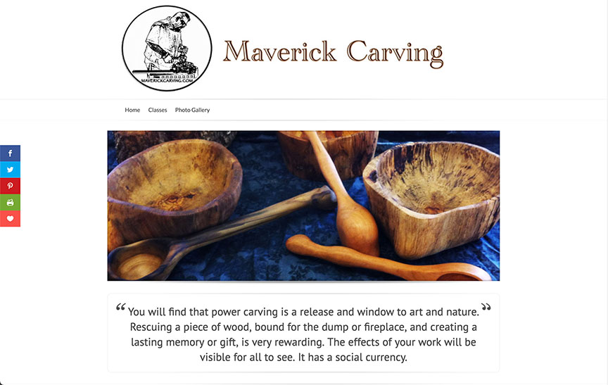
Maverick Carving
Building a Simple, Effective Website & Class Registration
CHALLENGE: Create a new online home and an easy way for students to sign up for workshops.
STRATEGY: Design a clear WordPress site that’s easy to update, easy to use, and easy for people to find in search results.
KEY TAKEAWAY: For instructors who manage multiple classes and locations, a well-organized website with simple online registration can save time, increase visibility, build trust with new students, and make it simpler for people to sign up.
Wood carving instructor Maverick Jaillet came to me with great content and a clear goal: he wanted a website that would make his life easier. Without a website, he spent a lot of time answering the same questions and sending out details about his classes over and over again.
My job was to take everything he already had—his class information, photos, and experience—and turn it into a website that was easy for the right people to find and simple for them to use. The design highlights the beautiful work Maverick and his students create, while keeping the focus on clear information and next steps.
To simplify the way he runs his business, I built a WordPress site that brings all of his workshop details into one place. Now he can log in and update class information himself without needing technical help. Each class page includes the key details students need plus a straightforward way to register, so Maverick spends less time on email and more time doing what he loves—teaching and carving.
Because most of Maverick’s students find him through word of mouth, I also added basic local SEO so people looking for local wood carving classes can find him more easily online. His website now supports the referrals he already gets and helps new students discover his work.

Millicent Meng - Photographer
Developing a New Web Presence
CHALLENGE: Create a simple, beautiful website that works well now, but can easily grow later.
STRATEGY: Build a clean, modular site that fits the client’s style and makes future updates and add-ons straightforward.
KEY TAKEAWAY: You don’t need a giant, “finished” website on day one. A flexible, staged approach lets you start strong and grow at your own pace.
Millicent Meng wanted a minimalist, elegant site that felt like her photography—calm, intentional, and uncluttered. Like many creatives and solo business owners, she knew she needed a solid online presence but didn’t want to get buried in tech, endless decisions, or marketing tasks she’d never have time to maintain.
We started with the essentials: a clean, sophisticated gallery that put her images front and center. Instead of building a full e-commerce system right away, each photo links directly to her existing print store. This lets her sell prints online without the extra cost, setup, or complexity of a full shopping cart. A simple lightbox view lets visitors click on an image, see it larger, and then go to the purchase page when they’re ready.
Because photography sites are mostly images, they can be hard for search engines to understand. To help people actually find her, every gallery image and page was carefully labeled and described. That meant thoughtful image names, detailed alt text, and clear captions that used the same kind of language her ideal clients might search for.
With the structure and basics in place, Millie can now add more over time—stronger messaging, email signups, promotions, and, eventually, a fuller online store if she chooses. By starting with a simple, well-planned site, she has room to grow without feeling pressured to do everything at once.
By now, you’ve probably noticed that every client’s journey looks quite different.
What's important is getting a clear sense of where you want to go, so you can choose a pace and approach that feel right for you.
If you’re not sure where to start, schedule a free chat to discuss how I can help you. It's a great opportunity to ask questions or get a friendly snapshot of what’s working and what might be holding you back.
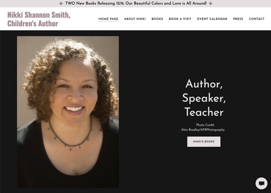
Nikki Shannon Smith - Children's Book Author
Tech Help & SEO Assessment
CHALLENGE: Help a creative, DIY website owner move to a new platform without overwhelm.
STRATEGY: Offer simple, step-by-step tech help, guide the platform switch, and provide an SEO checkup so the site stays easy to find and use.
KEY TAKEAWAY: For DIYers, having clear guidance and a basic SEO plan during a platform change can save time, lower stress, and turn a stressful tech chore into a chance to improve the website and visibility.
Children’s author Nikki Shannon Smith had already built her own website. Then her web host announced that the platform she used was shutting down. If she didn’t rebuild her site on the new system, her website would eventually disappear.
That meant starting over with new tools and a new layout—a lot for any solo small business owner. Creating your first DIY site is hard enough. Rebuilding it from scratch on a different platform can feel like too much, especially when you’d rather spend your energy writing, creating, or working with clients.
Nikki could have tried to handle it all through tutorials and trial and error, but that often takes more time and guesswork than most creatives have space for. Instead, we worked together. I broke the process into clear steps, answered questions in real time, and stepped in with hands-on tech support when needed.
Once her new site was in place, I reviewed the layout, suggested practical accessibility improvements, and completed an SEO assessment so she could see what to adjust. Now Nikki’s website is easier to use, more welcoming for visitors, and better set up to be found by the right readers—while she still stays in control and manages it herself.

Lynne Latham - Sustainable Design & Construction
Keeping a Website Current (Without a Full Rebrand)
CHALLENGE: Refresh an outdated WordPress site while keeping communication with clients clear during a time of change.
STRATEGY: Update the site’s design and content, fix what was broken, and use simple, thoughtful SEO to keep the right people finding her.
KEY TAKEAWAY: A website doesn’t need a total overhaul to stay effective. Regular updates to content, visuals, and SEO help your site stay relevant and visible — especially when your business is in transition.
Lynne Latham’s sustainable design website was starting to show its age. Old features, outdated text, and older photos were making her brand look less polished than the work she actually does. At the same time, she was rethinking her next steps in business, so a big, dramatic rebrand didn’t make sense.
She still needed a site that looked alive, current, and trustworthy — without confusing her existing clients or overpromising what was coming next.
I stepped in to quietly refresh what was already there. I updated the wording so it felt more current, swapped out tired photos, and replaced or repaired broken features that were getting in the way. Behind the scenes, I tuned up the SEO so that people looking for eco-conscious, sustainable design could actually find her.
Throughout the process, I kept her core message and visual style in place. The site still felt like Lynne — just clearer, cleaner, and easier to navigate. That way, her values and personality stayed front and center, while the site remained flexible enough to grow with whatever she decides to do next.
The result: a well-maintained website that supports business continuity, keeps clients informed, and stays engaging — even while the bigger plans are still taking shape.

Destination 74 - Events & Lodging
Making the Website Easier to Use (Without Extra Tech Headaches)
CHALLENGE: Make event registration simpler and improve accessibility, all within a platform that doesn’t allow for a lot of customization.
STRATEGY: Lean on smart technical tweaks to automate what we could and add only the most useful, user-friendly features
KEY TAKEAWAY: When key tasks are automated and the site is easier to read and navigate, the website stops being a time-waster and starts working like a quiet assistant in the background — freeing the owner to focus on the work they actually enjoy.
Destination 74 is built on Showit, a platform connected to WordPress that comes with its own quirks and limitations. The owner didn’t want to spend hours trying to figure it all out, so she handed that part off to me. That freed her up to stay in her zone of genius — hosting meaningful events and tending to a beautiful destination
One of her biggest needs was to simplify event registration for both herself and her guests. That meant creating an events page, gallery, and registration forms that not only looked good, but also worked smoothly behind the scenes. This cut down on repetitive admin tasks and made booking events feel straightforward instead of frustrating. Now, instead of wrestling with forms and settings, she can put her energy into planning better events and creating a more welcoming guest experience.
Another priority was improving accessibility and overall ease of use. On the original site, the text was too small to read comfortably, and the headings didn’t stand out enough to guide visitors. It was hard to quickly see what was important. By adjusting the typography and clarifying the content hierarchy, I made the site easier to read and navigate. These changes helped visitors move through the site more naturally and encouraged them to spend more time exploring the events and lodging options she offers.
I'm happy to answer questions. Feel free to contact me.